Art Dump! All Characters Except For Asael And Comet (top Right And Middle Right) Belong To Me.
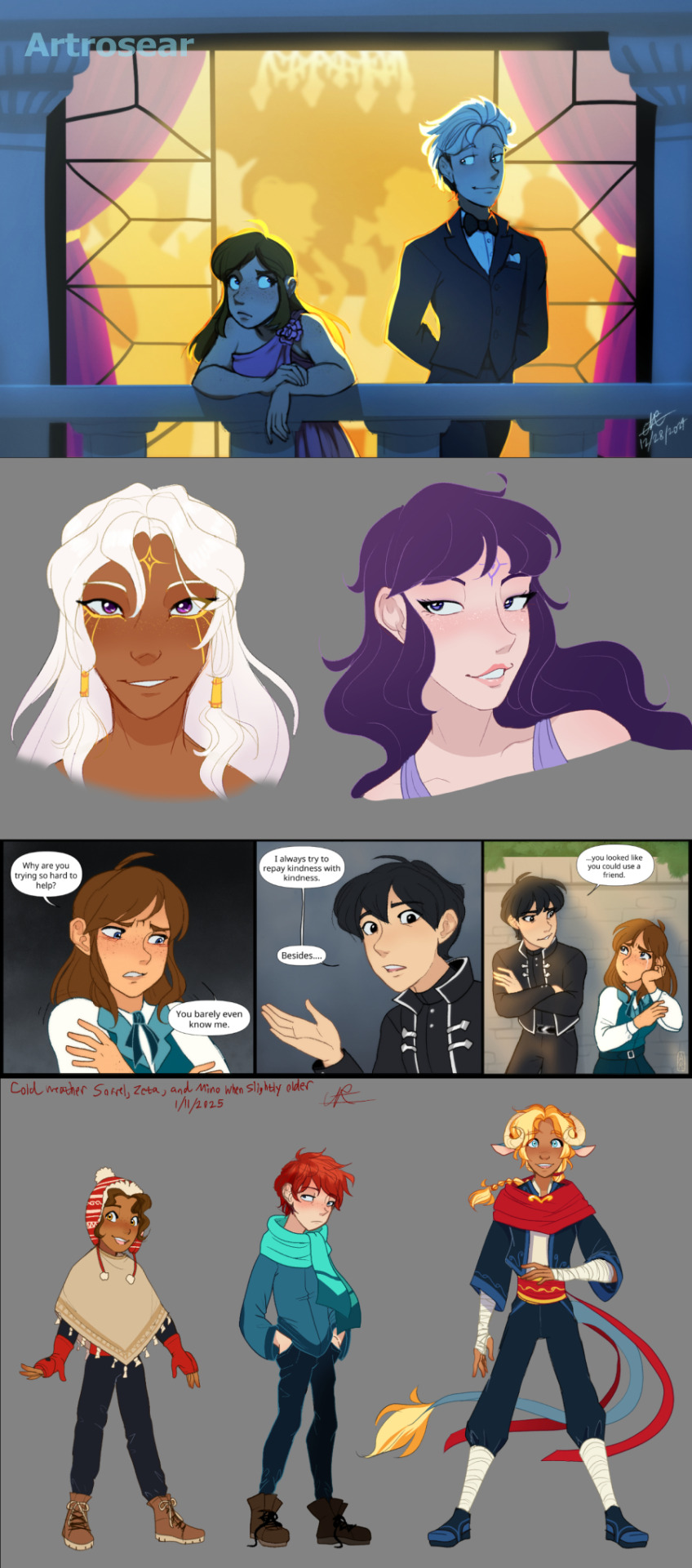
Art dump! All characters except for Asael and Comet (top right and middle right) belong to me.
More Posts from Artrosear and Others


...that your audience won't hate.
This is a method I started using when NFTs were on the rise - thieves would have to put actual work into getting rid of the mark - and one that I am now grateful for with the arrival of AI. Why? Because anyone who tries to train an AI on my work will end up with random, disruptive color blobs.
I can't say for sure it'll stop theft entirely, but it WILL make your images annoying for databases to incorporate, and add an extra layer of inconvenience for thieves. So as far as I'm concerned, that's a win/win.
I'll be showing the steps in CSP, but it should all be pretty easy to replicate in Photoshop.
Now: let's use the above image as our new signature file. I set mine to be 2500 x 1000 pixels when I'm just starting out.
Note that your text should not have a lot of anti-aliasing, so using a paint brush to start isn't going to work well with this method. Just use the standard G-Pen if you're doing this by hand, or, just use the text tool and whichever font you prefer.
Once that's done, take your magic wand tool, and select all the black. Here are the magic wand settings I'm using to make the selections:

All selected?

Good.
Now, find a brush with a scattering/tone scraping effect. I use one like this.

You can theoretically use any colors you want for this next part, but I'd recommend pastels as they tend to blend better.
Either way, let's add some color to the text.

Once that's finished,
You're going to want to go to Layer Property, and Border Effect

You'll be given an option of choosing color and thickness. Choose black, and go for at least a 5 in thickness. Adjust per your own preferences.

Now create a layer beneath your sig layer, and merge the sig down onto the blank layer.


This effectively 'locks in' the border effect, which is exactly what we want.
Hooray, you've finished your watermark!

Now let's place that bad boy into your finished piece.

You'll get the best mileage out of a mark if you can place it over a spot that isn't black of white, since you'll get better blending options that way. My preference is for Overlay.


From here, I'll adjust the opacity to around 20-25, depending on the image.

If you don't have a spot to use overlay, however, there's a couple other options. For white, there's Linear Burn, which imho doesn't look as good, but it still works in a pinch.

And for lots of black, you have Linear Light

Either way, you're in business!
EDIT since this has escaped my usual circles, and folks aren't as familiar with my personal usage:
An example of one of my own finished pieces, with watermark, so you can see what I mean about 'relatively unobtrusive'-- I try to at least use them as framing devices, or let them work with the image somehow (or, at the very least, not actively against it).

I know it's a bummer for some people to "ruin" their work with watermarks, which is part of the reason I developed this mark in particular. Its disruption is about as minimal as I can make it while still letting it serve its intended purpose.
There's other methods, too, of course! But this is the one I use, and the one I can speak on. Hope it helps some of you!
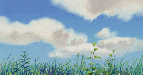

A blue flower field study I did off a photo I found on Pinterest!
ok wait, reblog if you’ve cried at least once because of math, doesn’t matter which grade i’m trying to prove something

Jupiter in false-color ultraviolet ©
“the algorithm only shows us _____” so stop looking at the algorithm. you don't need it. go to a thrift store and flip through some magazines from the 1980s. go read a random book that’s no longer in print on the internet archive. go to a museum and walk around until you see an artwork you don’t recognize. go get a cookbook from the library and make a recipe you've never tried. go listen to the radio. go talk to people in real life. go write a poem or a song and don't show anybody. go take a walk. you are not confined to your online content feed. you never have been!!!!!!!
I'm obsessed with the way different architectural styles reflect different aspects of God.
Like, gothic? The spires and the stained glass and the pointed arches? The gargoyles on the outside of churches, signifying that the demons can't enter into a sacred space? It's grand, almost foreboding. It sings in the piercing, ethereal song of the dryads of old, "He is not safe, but He is good."

And then there is romanesque, and it is God as fortress, God as bulwark. Round arches, heavy stones. Sturdy, safety, support. It sings in low Gregorian chant, "God is my strong tower, my refuge."

And then there is Baroque. And your breath stalls in your throat, and your heart does something strange because, oh—oh this must be what heaven looks like. It's dazzling, marvelous, almost a dream. And its song is not in words because there are no words to express it except "Sanctus, sanctus, sanctus." But its chorus is celestial all the same. It is God as Divine Beauty, the source from which all beauty flows.


Sometimes I completely forget I drew this Moomin x Ghibli thing
The idea is Studio Ghibli adapted Comet in Moominland and the gang recently met Snufkin in their adventure
-
 the-tiny-dragons-tea-room liked this · 4 months ago
 -
 starfayy liked this · 4 months ago
 -
 larissa-the-scribe liked this · 4 months ago
 -
 knight5tar liked this · 4 months ago
 -
 artrosear reblogged this · 4 months ago

💙Christian💙24✨Digital/Traditional Artist✨🎵Music Creator🎶☁️Professional Daydreamer🫧NO politics allowed | NO hostile/rude behavior | NO AI. Human artists/art only!🪐Current Hyperfixation💫~Fields of Mistria~
57 posts