Stellar Parallax
Stellar parallax
In astronomy, parallax is the difference in the apparent position of an object seen by observers in different places. Stellar parallax is used to measure the distance of stars using the motion of the Earth in its orbit. Created by the different orbital positions of Earth, the extremely small observed shift is largest at time intervals of about six months, when Earth arrives at exactly opposite sides of the Sun in its orbit, giving a baseline distance of about two astronomical units between observations. The parallax itself is considered to be half of this maximum, about equivalent to the observational shift that would occur due to the different positions of Earth and the Sun, a baseline of one astronomical unit (AU).

Stellar parallax is so difficult to detect that its existence was the subject of much debate in astronomy for thousands of years. It was first observed by Giuseppe Calandrelli who reported parallax in α-Lyrae in his work “Osservazione e riflessione sulla parallasse annua dall’alfa della Lira”. Then in 1838 Friedrich Bessel made the first successful parallax measurement ever, for the star 61 Cygni, using a Fraunhofer heliometer at Königsberg Observatory.

Once a star’s parallax is known, its distance from Earth can be computed trigonometrically. But the more distant an object is, the smaller its parallax. Even with 21st-century techniques in astrometry, the limits of accurate measurement make distances farther away than about 100 parsecs (roughly 326 light years) too approximate to be useful when obtained by this technique. This limits the applicability of parallax as a measurement of distance to objects that are relatively close on a galactic scale. Other techniques, such as spectral red-shift, are required to measure the distance of more remote objects.
source
More Posts from Carlosalberthreis and Others
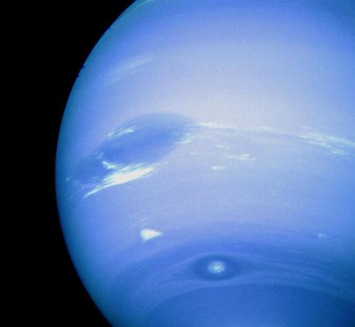
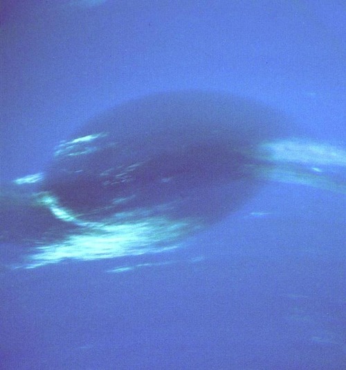
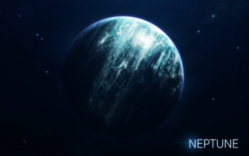
This photograph of Neptune was reconstructed from two images taken by Voyager 2’s narrow-angle camera, through the green and clear filters. At the north (top) is the Great Dark Spot, accompanied by bright, white clouds that undergo rapid changes in appearance.
Credit: NASA
The Moon in Motion
Happy New Year! And happy supermoon! Tonight, the Moon will appear extra big and bright to welcome us into 2018 – about 6% bigger and 14% brighter than the average full Moon. And how do we know that? Well, each fall, our science visualizer Ernie Wright uses data from the Lunar Reconnaissance Orbiter (LRO) to render over a quarter of a million images of the Moon. He combines these images into an interactive visualization, Moon Phase and Libration, which depicts the Moon at every day and hour for the coming year.
Want to see what the Moon will look like on your birthday this year? Just put in the date, and even the hour (in Universal Time) you were born to see your birthday Moon.
Our Moon is quite dynamic. In addition to Moon phases, our Moon appears to get bigger and smaller throughout the year, and it wobbles! Or at least it looks that way to us on Earth. This wobbling is called libration, from the Latin for ‘balance scale’ (libra). Wright relies on LRO maps of the Moon and NASA orbit calculations to create the most accurate depiction of the 6 ways our Moon moves from our perspective.
1. Phases

The Moon phases we see on Earth are caused by the changing positions of the Earth and Moon relative to the Sun. The Sun always illuminates half of the Moon, but we see changing shapes as the Moon revolves around the Earth. Wright uses a software library called SPICE to calculate the position and orientation of the Moon and Earth at every moment of the year. With his visualization, you can input any day and time of the year and see what the Moon will look like!
2. Shape of the Moon

Check out that crater detail! The Moon is not a smooth sphere. It’s covered in mountains and valleys and thanks to LRO, we know the shape of the Moon better than any other celestial body in the universe. To get the most accurate depiction possible of where the sunlight falls on the lunar surface throughout the month, Wright uses the same graphics software used by Hollywood design studios, including Pixar, and a method called ‘raytracing’ to calculate the intricate patterns of light and shadow on the Moon’s surface, and he checks the accuracy of his renders against photographs of the Moon he takes through his own telescope.

3. Apparent Size

The Moon Phase and Libration visualization shows you the apparent size of the Moon. The Moon’s orbit is elliptical, instead of circular - so sometimes it is closer to the Earth and sometimes it is farther. You’ve probably heard the term “supermoon.” This describes a full Moon at or near perigee (the point when the Moon is closest to the Earth in its orbit). A supermoon can appear up to 14% bigger and brighter than a full Moon at apogee (the point when the Moon is farthest from the Earth in its orbit).
Our supermoon tonight is a full Moon very close to perigee, and will appear to be about 14% bigger than the July 27 full Moon, the smallest full Moon of 2018, occurring at apogee. Input those dates into the Moon Phase and Libration visualization to see this difference in apparent size!
4. East-West Libration
Over a month, the Moon appears to nod, twist, and roll. The east-west motion, called ‘libration in longitude’, is another effect of the Moon’s elliptical orbital path. As the Moon travels around the Earth, it goes faster or slower, depending on how close it is to the Earth. When the Moon gets close to the Earth, it speeds up thanks to an additional pull from Earth’s gravity. Then it slows down, when it’s farther from the Earth. While this speed in orbital motion changes, the rotational speed of the Moon stays constant.
This means that when the Moon moves faster around the Earth, the Moon itself doesn’t rotate quite enough to keep the same exact side facing us and we get to see a little more of the eastern side of the Moon. When the Moon moves more slowly around the Earth, its rotation gets a little ahead, and we see a bit more of its western side.
5. North-South Libration

The Moon also appears to nod, as if it were saying “yes,” a motion called ‘libration in latitude’. This is caused by the 5 degree tilt of the Moon’s orbit around the Earth. Sometimes the Moon is above the Earth’s northern hemisphere and sometimes it’s below the Earth’s southern hemisphere, and this lets us occasionally see slightly more of the northern or southern hemispheres of the Moon!
6. Axis Angle

Finally, the Moon appears to tilt back and forth like a metronome. The tilt of the Moon’s orbit contributes to this, but it’s mostly because of the 23.5 degree tilt of our own observing platform, the Earth. Imagine standing sideways on a ramp. Look left, and the ramp slopes up. Look right and the ramp slopes down.
Now look in front of you. The horizon will look higher on the right, lower on the left (try this by tilting your head left). But if you turn around, the horizon appears to tilt the opposite way (tilt your head to the right). The tilted platform of the Earth works the same way as we watch the Moon. Every two weeks we have to look in the opposite direction to see the Moon, and the ground beneath our feet is then tilted the opposite way as well.
So put this all together, and you get this:
Beautiful isn’t it? See if you can notice these phenomena when you observe the Moon. And keep coming back all year to check on the Moon’s changing appearance and help plan your observing sessions.
Follow @NASAMoon on Twitter to keep up with the latest lunar updates.
Make sure to follow us on Tumblr for your regular dose of space: http://nasa.tumblr.com.


A fotografia desta semana mostra fitas de gás e poeira em torno do centro da galáxia espiral barrada NGC 1398. Esta galáxia situa-se na constelação da Fornalha, a aproximadamente 65 milhões de anos-luz de distância da Terra.
Em vez de começarem no meio da galáxia e espiralarem para o exterior, os braços em espiral da NGC 1398 têm origem numa barra direita, formada de estrelas, que corta a região central da galáxia. Uma grande parte das galáxias em espiral — cerca de dois terços — apresenta esta estrutura, no entanto ainda não é claro se e como é que estas barras afectam o comportamento e o desenvolvimento das suas galáxias.
Esta imagem foi criada a partir de dados obtidos pelo instrumento FORS2 (FOcal Reducer/low dispersion Spectrograph 2), montado no Very Large Telescope do ESO (VLT) no Observatório do Paranal, no Chile, e mostra a NGC 1398 em grande detalhe, dos escuros trilhos de poeira que sarapintam os braços em espiral às regiões de formação estelar em tons rosa que aparecem nas regiões mais externas.
A imagem foi criada no âmbito do programa Jóias Cósmicas do ESO, o qual visa obter imagens de objetos interessantes, intrigantes ou visualmente atrativos, utilizando os telescópios do ESO, para efeitos de educação e divulgação científica. O programa utiliza tempo de telescópio que não pode ser usado em observações científicas. Todos os dados obtidos podem ter igualmente interesse científico e são por isso postos à disposição dos astrónomos através do arquivo científico do ESO. Crédito da Imagem: ESO
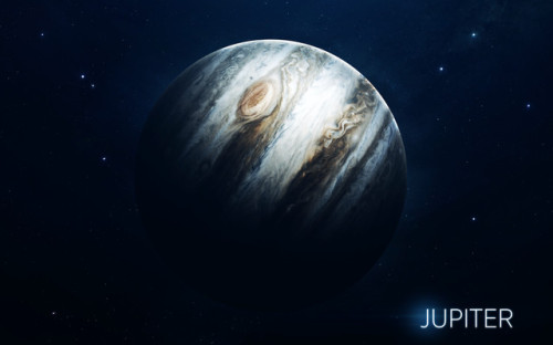
Incoming! We’ve Got Science from Jupiter!
Our Juno spacecraft has just released some exciting new science from its first close flyby of Jupiter!

In case you don’t know, the Juno spacecraft entered orbit around the gas giant on July 4, 2016…about a year ago. Since then, it has been collecting data and images from this unique vantage point.

Juno is in a polar orbit around Jupiter, which means that the majority of each orbit is spent well away from the gas giant. But once every 53 days its trajectory approaches Jupiter from above its north pole, where it begins a close two-hour transit flying north to south with its eight science instruments collecting data and its JunoCam camera snapping pictures.

Space Fact: The download of six megabytes of data collected during the two-hour transit can take one-and-a-half days!

Juno and her cloud-piercing science instruments are helping us get a better understanding of the processes happening on Jupiter. These new results portray the planet as a complex, gigantic, turbulent world that we still need to study and unravel its mysteries.
So what did this first science flyby tell us? Let’s break it down…
1. Tumultuous Cyclones

Juno’s imager, JunoCam, has showed us that both of Jupiter’s poles are covered in tumultuous cyclones and anticyclone storms, densely clustered and rubbing together. Some of these storms as large as Earth!

These storms are still puzzling. We’re still not exactly sure how they formed or how they interact with each other. Future close flybys will help us better understand these mysterious cyclones.

Seen above, waves of clouds (at 37.8 degrees latitude) dominate this three-dimensional Jovian cloudscape. JunoCam obtained this enhanced-color picture on May 19, 2017, at 5:50 UTC from an altitude of 5,500 miles (8,900 kilometers). Details as small as 4 miles (6 kilometers) across can be identified in this image.

An even closer view of the same image shows small bright high clouds that are about 16 miles (25 kilometers) across and in some areas appear to form “squall lines” (a narrow band of high winds and storms associated with a cold front). On Jupiter, clouds this high are almost certainly comprised of water and/or ammonia ice.
2. Jupiter’s Atmosphere
Juno’s Microwave Radiometer is an instrument that samples the thermal microwave radiation from Jupiter’s atmosphere from the tops of the ammonia clouds to deep within its atmosphere.

Data from this instrument suggest that the ammonia is quite variable and continues to increase as far down as we can see with MWR, which is a few hundred kilometers. In the cut-out image below, orange signifies high ammonia abundance and blue signifies low ammonia abundance. Jupiter appears to have a band around its equator high in ammonia abundance, with a column shown in orange.

Why does this ammonia matter? Well, ammonia is a good tracer of other relatively rare gases and fluids in the atmosphere…like water. Understanding the relative abundances of these materials helps us have a better idea of how and when Jupiter formed in the early solar system.
This instrument has also given us more information about Jupiter’s iconic belts and zones. Data suggest that the belt near Jupiter’s equator penetrates all the way down, while the belts and zones at other latitudes seem to evolve to other structures.
3. Stronger-Than-Expected Magnetic Field

Prior to Juno, it was known that Jupiter had the most intense magnetic field in the solar system…but measurements from Juno’s magnetometer investigation (MAG) indicate that the gas giant’s magnetic field is even stronger than models expected, and more irregular in shape.

At 7.766 Gauss, it is about 10 times stronger than the strongest magnetic field found on Earth! What is Gauss? Magnetic field strengths are measured in units called Gauss or Teslas. A magnetic field with a strength of 10,000 Gauss also has a strength of 1 Tesla.

Juno is giving us a unique view of the magnetic field close to Jupiter that we’ve never had before. For example, data from the spacecraft (displayed in the graphic above) suggests that the planet’s magnetic field is “lumpy”, meaning its stronger in some places and weaker in others. This uneven distribution suggests that the field might be generated by dynamo action (where the motion of electrically conducting fluid creates a self-sustaining magnetic field) closer to the surface, above the layer of metallic hydrogen. Juno’s orbital track is illustrated with the black curve.
4. Sounds of Jupiter
Juno also observed plasma wave signals from Jupiter’s ionosphere. This movie shows results from Juno’s radio wave detector that were recorded while it passed close to Jupiter. Waves in the plasma (the charged gas) in the upper atmosphere of Jupiter have different frequencies that depend on the types of ions present, and their densities.
Mapping out these ions in the jovian system helps us understand how the upper atmosphere works including the aurora. Beyond the visual representation of the data, the data have been made into sounds where the frequencies and playback speed have been shifted to be audible to human ears.
5. Jovian “Southern Lights”

The complexity and richness of Jupiter’s “southern lights” (also known as auroras) are on display in this animation of false-color maps from our Juno spacecraft. Auroras result when energetic electrons from the magnetosphere crash into the molecular hydrogen in the Jovian upper atmosphere. The data for this animation were obtained by Juno’s Ultraviolet Spectrograph.

During Juno’s next flyby on July 11, the spacecraft will fly directly over one of the most iconic features in the entire solar system – one that every school kid knows – Jupiter’s Great Red Spot! If anybody is going to get to the bottom of what is going on below those mammoth swirling crimson cloud tops, it’s Juno.

Stay updated on all things Juno and Jupiter by following along on social media: Twitter | Facebook | YouTube | Tumblr
Learn more about the Juno spacecraft and its mission at Jupiter HERE.


Berries - Vadim Sadovski

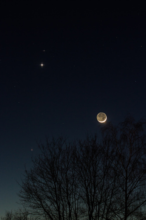
Conjunction: Mars, Venus and Moon
by Stefan Grießinger
Are we alone in the universe?
There’s never been a better time to ponder this age-old question. We now know of thousands of exoplanets – planets that orbit stars elsewhere in the universe.

So just how many of these planets could support life?
Scientists from a variety of fields — including astrophysics, Earth science, heliophysics and planetary science — are working on this question. Here are a few of the strategies they’re using to learn more about the habitability of exoplanets.
Squinting at Earth
Even our best telescopic images of exoplanets are still only a few pixels in size. Just how much information can we extract from such limited data? That’s what Earth scientists have been trying to figure out.
One group of scientists has been taking high-resolution images of Earth from our Earth Polychromatic Imaging Camera and ‘degrading’ them in order to match the resolution of our pixelated exoplanet images. From there, they set about a grand process of reverse-engineering: They try to extract as much accurate information as they can from what seems — at first glance — to be a fairly uninformative image.

Credits: NOAA/NASA/DSCOVR
So far, by looking at how Earth’s brightness changes when land versus water is in view, scientists have been able to reverse-engineer Earth’s albedo (the proportion of solar radiation it reflects), its obliquity (the tilt of its axis relative to its orbital plane), its rate of rotation, and even differences between the seasons. All of these factors could potentially influence a planet’s ability to support life.
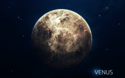
Avoiding the “Venus Zone”
In life as in science, even bad examples can be instructive. When it comes to habitability, Venus is a bad example indeed: With an average surface temperature of 850 degrees Fahrenheit, an atmosphere filled with sulfuric acid, and surface pressure 90 times stronger than Earth’s, Venus is far from friendly to life as we know it.

The surface of Venus, imaged by Soviet spacecraft Venera 13 in March 1982
Since Earth and Venus are so close in size and yet so different in habitability, scientists are studying the signatures that distinguish Earth from Venus as a tool for differentiating habitable planets from their unfriendly look-alikes.
Using data from our Kepler Space Telescope, scientists are working to define the “Venus Zone,” an area where planetary insolation – the amount of light a given planet receives from its host star – plays a key role in atmospheric erosion and greenhouse gas cycles.

Planets that appear similar to Earth, but are in the Venus Zone of their star, are, we think, unlikely to be able to support life.
Modeling Star-Planet Interactions
When you don’t know one variable in an equation, it can help to plug in a reasonable guess and see how things work out. Scientists used this process to study Proxima b, our closest exoplanet neighbor. We don’t yet know whether Proxima b, which orbits the red dwarf star Proxima Centauri four light-years away, has an atmosphere or a magnetic field like Earth’s. However, we can estimate what would happen if it did.
The scientists started by calculating the radiation emitted by Proxima Centauri based on observations from our Chandra X-ray Observatory. Given that amount of radiation, they estimated how much atmosphere Proxima b would be likely to lose due to ionospheric escape — a process in which the constant outpouring of charged stellar material strips away atmospheric gases.

With the extreme conditions likely to exist at Proxima b, the planet could lose the equivalent of Earth’s entire atmosphere in 100 million years — just a fraction of Proxima b’s 4-billion-year lifetime. Even in the best-case scenario, that much atmospheric mass escapes over 2 billion years. In other words, even if Proxima b did at one point have an atmosphere like Earth, it would likely be long gone by now.
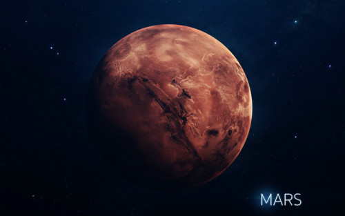
Imagining Mars with a Different Star
We think Mars was once habitable, supporting water and an atmosphere like Earth’s. But over time, it gradually lost its atmosphere – in part because Mars, unlike Earth, doesn’t have a protective magnetic field, so Mars is exposed to much harsher radiation from the Sun’s solar wind.

But as another rocky planet at the edge of our solar system’s habitable zone, Mars provides a useful model for a potentially habitable planet. Data from our Mars Atmosphere and Volatile Evolution, or MAVEN, mission is helping scientists answer the question: How would Mars have evolved if it were orbiting a different kind of star?
Scientists used computer simulations with data from MAVEN to model a Mars-like planet orbiting a hypothetical M-type red dwarf star. The habitable zone of such a star is much closer than the one around our Sun.

Being in the habitable zone that much closer to a star has repercussions. In this imaginary situation, the planet would receive about 5 to 10 times more ultraviolet radiation than the real Mars does, speeding up atmospheric escape to much higher rates and shortening the habitable period for the planet by a factor of about 5 to 20.
These results make clear just how delicate a balance needs to exist for life to flourish. But each of these methods provides a valuable new tool in the multi-faceted search for exoplanet life. Armed with these tools, and bringing to bear a diversity of scientific perspectives, we are better positioned than ever to ask: are we alone?
Make sure to follow us on Tumblr for your regular dose of space: http://nasa.tumblr.com.
-
 bubble11yeli reblogged this · 11 months ago
 -
 adorable-animals-daily liked this · 3 years ago
 -
 yuriwarrior liked this · 3 years ago
 -
 powerlatino1 liked this · 4 years ago
 -
 vaen-tae liked this · 4 years ago
 -
 darcys-bxtch liked this · 4 years ago
 -
 goopi-e liked this · 5 years ago
 -
 aleatorybrain reblogged this · 5 years ago
 -
 twstdmultitude liked this · 5 years ago
 -
 aealoarcturus reblogged this · 5 years ago
 -
 sunlit-music liked this · 5 years ago
 -
 siodymph liked this · 5 years ago
 -
 saltythexfilesindianjonescop liked this · 5 years ago
 -
 tclhb liked this · 5 years ago
 -
 phantom-streaker reblogged this · 5 years ago
 -
 isaiahthirtytwentyone liked this · 5 years ago
 -
 punk-rock-attitude liked this · 5 years ago
 -
 bibliophiliosaurus reblogged this · 5 years ago
 -
 wizardcowpoke liked this · 5 years ago
 -
 waltersbreath liked this · 5 years ago
 -
 the-telescope-times liked this · 5 years ago
 -
the-telescope-times reblogged this · 5 years ago
-
dirtwolff reblogged this · 5 years ago
-
 dataslifeforms liked this · 5 years ago
 -
 gemchrys liked this · 5 years ago
 -
 andromeda1023 reblogged this · 5 years ago
 -
 ad-astra-per-aspera-80 reblogged this · 5 years ago
 -
ad-astra-per-aspera-80 liked this · 5 years ago
-
 particlepostgrad reblogged this · 5 years ago
 -
alexxandro-mz liked this · 5 years ago
-
ic3-que3n liked this · 5 years ago
-
lazurasarias liked this · 5 years ago
-
 scarlet963 reblogged this · 5 years ago
 -
 blackwolfshadowclaw reblogged this · 5 years ago
