Rampantbottles - It's Nouveau, Baby!
More Posts from Rampantbottles and Others

Pigeons!
Here's a collection of pet portraits I had a pleasure of painting for the great Keepsakesloft and Rey <3 Thank you both so much for this!


Malayan Tapirs 5-6-23
Hell is a place where you have to draw a tapir’s head at ¾ view.
I didn’t end up drawing any baby tapirs, but it's important for you all to know they have markings like a watermelon.


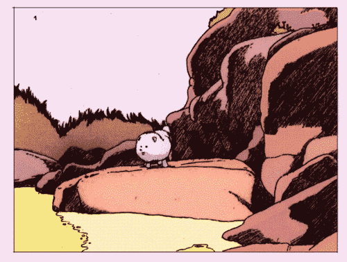
Is it a tower ? Is it a tunnel ? Up or down, the path only lead forward, toward enlightenment. 🍀🧬
Clic on the first picture to see full resolution


oh i meant indirect reflected light! you have some interesting color choices there
sorry for the confusion ^^'
(in reference to this ask:)

no worries about the confusion!
to me, the most important functions of reflected light are a) the ability to quickly let the viewer's brain know that two objects in the picture are inhabiting the same space, b) tie the painting together by intermingling different colors and c) create visual metaphor if needed. because of that, more often than not, i simplify and exaggerate reflected light and there isn't much complex photo-realistic stuff going on in my style. in general, i consider/employ the following:
the two most important aspects of reflected light that i primarily think about are the hue and the strength of it (these are not really technical terms, only what i consider when painting). the hue mainly depends on the hues of the two objects that are casting the reflected light onto each other (e.g., one is purple and the other is red), and the strength depends on more factors, such as the values of the objects (i.e., how dark/light they are), their texture/reflectiveness, the degree of saturation (e.g., neon pink vs muted powder pink) and how far away the objects are from each other.
the hue is the simplest part—a blue object will cast blue reflected light onto another object, an orange one will cast orange light, and so on. the easiest way to depict that is to simply use the local color of the object (the local color is the 'true' color of the object, unaffected by light and shadow) to lightly paint on the reflected light (i use paint tool sai and its blending engine is excellent—you can very easily control how much color you want to impart). here you can see the pink backpack reflecting pink light onto the mint hoodie, and vice versa. it's very straightforward—the reflected light was lightly brushed on using the local color (or something similar) of the backpack and the hoodie respectively:

i don't always use the local color/hue of the nearest object though. the reason for that is both physical/optical and artistic: the physical is in the fact that very often, your reflected/indirect light will be affected not only by the color of the nearest object, but other objects around it too (unless the two objects that you're depicting are right up against each other; then they largely block out the reflected light from other sources). the artistic is in the fact that sometimes, changing the color of the reflected light allows you to tie the picture together and/or change/amplify the mood. like here:

the reflected light on the forehead/face on the right is orange-ish/peach—makes sense, the human on the left has a light beige skin tone. but the reflected light on the human is not grayish-purple like the skin tone of the other character would suggest—instead, it's a pretty bright pink. the reason i chose that color is because i wanted to warm up the color of the reflected light based on the influence of the surroundings (here, it's brightly lit sand), but still keep the hint of purple to create a visual metaphor of the two characters casting light onto each other in the shadow.
as i've said before, the strength of the reflected light—i.e., how immediately visible it is—depends on a bunch of stuff. what i keep in mind for this (and in general) is that indirect light is called indirect because it's, well. not direct. it occurs in shadows and is the light that other objects have reflected. this matters because:
very, very simply put, a red object is red because it absorbs all wavelengths of visible light except for red, which it reflects. the more red it doesn't absorb, the more red it appears—a red apple will reflect more red than an orange. a black object is the more black the more light it absorbs; a white object is whiter when it reflects more of all wavelengths of visible light. so when a red object casts reflected light, it's gonna be the red wavelength cause it's absorbing everything else, and the higher the saturation of the object, the higher the saturation of the reflected light will be. for the same reason, the lighter an object is in value, the stronger the reflected light that it casts will be—because the object reflects a lot of light! if you put two very dark objects next to each other, you won't see much reflected light between them since they're absorbing everything. this is also why a reflective object of one color will cast a stronger reflected light onto something than a matte object of the same color would.

see how the nails reflect very bright yellow-ish light in the shadow that the fingers cast? i think this more than anything else imparts how shiny the nail polish is, because the matte by comparison purple-ish skin does not cast reflective light that is just as saturated.
because of the whole wavelength thing, when the two objects that are casting reflected light onto each other are the same or similar color, i make the reflected light more saturated. that bright salmon colored spot between the fingers in the picture below is there partially because the fingers are the same color and they keep bouncing the same wavelengths between each other like an echo chamber, which amplifies the saturation. technically speaking, reflected light can't be more or just as saturated/bright as the direct light bouncing off an object (makes sense—indirect light comes not from a light source but from an object that doesn't produce light, hence there's gonna be less of it). but i am not beholden to the rules of this physical universe. i wanted a saturated salmon spot there because i wanted to achieve a soft soap bubble quality to the color scheme, so i put it there. plus there's blood underneath the skin and subsurface scattering, but that's another thing that i'm not gonna touch upon here. the pearls are also casting bright orange light onto the palm all over the place because they're reflective.

how far the objects are from each other matters too, as well as the angles of their planes in relation to each other. the closer the objects are to each other, the stronger the reflected light will be, because it doesn't have enough time to disperse before it bounces back off the next object. however, if the angle between the planes of your objects is obtuse, they won't reflect light onto each other no matter how close they are. you can observe that if you put two brightly colored books next to each other—if their covers are at an acute angle to each other, the reflected light will be more saturated than if they're at a right angle, and you will hardly see any reflected light at all (from one of the books on the other) if the angle is obtuse.
i also always keep in might the kind of ambient reflected light that doesn't come from any nearby objects. like here:

tons of blue/periwinkle reflected light from the ambient color of the sky. or here:

there is a lot of green reflected light on the red shirt, even though the next closest thing is a white shirt. why the hell did i do that? mostly it was because there is a lot of greenery surrounding the characters and using tons of green in the reflected light/shadows tied the picture together. the other reason is because the planes of the folds of the red shirt are not parallel to the white shirt, and therefore i decided to make them pick up more green than white light, though you can still see the reflected white light (in the form of peach strokes) on the folds that are more parallel to the white shirt.
this is the gist of what i keep in mind when i do reflected light! it's not super realistic and i take a lot of liberties and sometimes realize later that i should have painted something differently. as always, i recommend using references whenever possible or needed, as well as observing the world in general to learn what light can do. reading up on reflected light in art and photography has also helped me a lot! i try not to feel too attached to how light would act in real life though—sometimes, artistic exaggeration and discretion helps me more than optics. if a red object casting green light will serve to relay my very important message or whatever, i'm gonna do that. my motto is that you can successfully break any rule as long as you know why the rule exists in the first place; if you know how reflected light works in real life/how to depict it realistically, you will know how to break those rules to achieve something different.
hope this post helps!
(shout out to critical role the show for sponsoring this entire tutorial (they paid me in dopamine). at first i tried to use art of different characters as examples but all of my recent stuff is fanart of the same two cringefail lads. update: oh god i'm rereading this and i hope everyone understood that this was a joke, they didn't actually sponsor me. i was just using my fanart of the characters that appear on the show because i've been drawing them a lot because i enjoy said show. end disclaimer. if any of you found this explanation useful and wanna toss a coin to me in thanks, my tip jar is here)

Francesca! My artfight attack on @orpheaster
I had a great time drawing her- absolutely love her design, so camp


At a Pheasant’s Wake
October
Digital Painting
-
 coupdetarte reblogged this · 5 days ago
 -
 phvnthom liked this · 1 week ago
 -
 alonelywaterbottle liked this · 2 weeks ago
 -
 abracandadice reblogged this · 2 weeks ago
 -
 invfrq liked this · 2 weeks ago
 -
 arbiechats reblogged this · 3 weeks ago
 -
 cocoa-system liked this · 3 weeks ago
 -
 adventureking liked this · 3 weeks ago
 -
 ashenmotive reblogged this · 1 month ago
 -
 sunandmoonseisai liked this · 1 month ago
 -
 seraphicdemons reblogged this · 2 months ago
 -
 portfoliodnmadenonactualise liked this · 2 months ago
 -
 mi-state-sul-cazzo liked this · 2 months ago
 -
 krazyonkatnip liked this · 2 months ago
 -
 picklegobbler9000 liked this · 2 months ago
 -
 joiesmineurs liked this · 2 months ago
 -
 dcbrierton reblogged this · 2 months ago
 -
 micer2012 liked this · 2 months ago
 -
 seiseiseitan liked this · 2 months ago
 -
 wingerb17 liked this · 2 months ago
 -
 andiest reblogged this · 2 months ago
 -
 butchagave liked this · 2 months ago
 -
 hauntedskeletonpup liked this · 2 months ago
 -
 rosehip-cordial reblogged this · 2 months ago
 -
 blackabsynthe reblogged this · 2 months ago
 -
 liapun liked this · 2 months ago
 -
 unmappedterritory liked this · 2 months ago
 -
 cheshiresol reblogged this · 2 months ago
 -
cheshiresol liked this · 2 months ago
-
yalyublyuypeyzazhi liked this · 2 months ago
-
 touchinggrass reblogged this · 2 months ago
 -
touchinggrass liked this · 2 months ago
-
 blondegoku reblogged this · 2 months ago
 -
 bigre-fichtre reblogged this · 2 months ago
 -
bigre-fichtre liked this · 2 months ago
-
 yugen-iki liked this · 2 months ago
 -
 perleaiporci liked this · 2 months ago
 -
 non-essere-cattivo reblogged this · 2 months ago
 -
 the-scared-raindrop liked this · 2 months ago
 -
 maitimosmissinghand liked this · 2 months ago
 -
 stunmewithyourlasers liked this · 2 months ago
 -
 decompostabile liked this · 2 months ago
 -
 coltellini reblogged this · 2 months ago
 -
coltellini liked this · 2 months ago
-
 pointlesslybirdie liked this · 2 months ago

Blight Townes 𓅥 𓃦 𓅐 𓅰 𓆨𓆝 𓆏 𓄀 𓃠 𓃶 𓅟 𓆟 𓆈 𓇗O' I love a good story
75 posts