Depixellation? Or Hallucination?
Depixellation? Or hallucination?
There’s an application for neural nets called “photo upsampling” which is designed to turn a very low-resolution photo into a higher-res one.
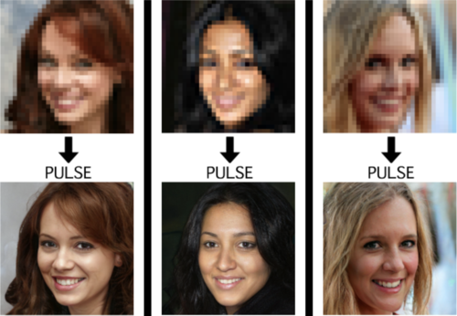
This is an image from a recent paper demonstrating one of these algorithms, called “PULSE: Self-Supervised Photo Upsampling via Latent Space Exploration of Generative Models”
It’s the neural net equivalent of shouting “enhance!” at a computer in a movie - the resulting photo is MUCH higher resolution than the original.
Could this be a privacy concern? Could someone use an algorithm like this to identify someone who’s been blurred out? Fortunately, no. The neural net can’t recover detail that doesn’t exist - all it can do is invent detail.
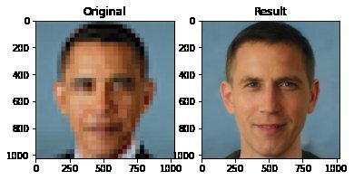
This becomes more obvious when you downscale a photo, give it to the neural net, and compare its upscaled version to the original.

As it turns out, there are lots of different faces that can be downscaled into that single low-res image, and the neural net’s goal is just to find one of them. Here it has found a match - why are you not satisfied?
And it’s very sensitive to the exact position of the face, as I found out in this horrifying moment below. I verified that yes, if you downscale the upscaled image on the right, you’ll get something that looks very much like the picture in the center. Stand way back from the screen and blur your eyes (basically, make your own eyes produce a lower-resolution image) and the three images below will look more and more alike. So technically the neural net did an accurate job at its task.

A tighter crop improves the image somewhat. Somewhat.

The neural net reconstructs what it’s been rewarded to see, and since it’s been trained to produce human faces, that’s what it will reconstruct. So if I were to feed it an image of a plush giraffe, for example…

Given a pixellated image of anything, it’ll invent a human face to go with it, like some kind of dystopian computer system that sees a suspect’s image everywhere. (Building an algorithm that upscales low-res images to match faces in a police database would be both a horrifying misuse of this technology and not out of character with how law enforcement currently manipulates photos to generate matches.)
However, speaking of what the neural net’s been rewarded to see - shortly after this particular neural net was released, twitter user chicken3gg posted this reconstruction:
Others then did experiments of their own, and many of them, including the authors of the original paper on the algorithm, found that the PULSE algorithm had a noticeable tendency to produce white faces, even if the input image hadn’t been of a white person. As James Vincent wrote in The Verge, “It’s a startling image that illustrates the deep-rooted biases of AI research.”
Biased AIs are a well-documented phenomenon. When its task is to copy human behavior, AI will copy everything it sees, not knowing what parts it would be better not to copy. Or it can learn a skewed version of reality from its training data. Or its task might be set up in a way that rewards - or at the least doesn’t penalize - a biased outcome. Or the very existence of the task itself (like predicting “criminality”) might be the product of bias.
In this case, the AI might have been inadvertently rewarded for reconstructing white faces if its training data (Flickr-Faces-HQ) had a large enough skew toward white faces. Or, as the authors of the PULSE paper pointed out (in response to the conversation around bias), the standard benchmark that AI researchers use for comparing their accuracy at upscaling faces is based on the CelebA HQ dataset, which is 90% white. So even if an AI did a terrible job at upscaling other faces, but an excellent job at upscaling white faces, it could still technically qualify as state-of-the-art. This is definitely a problem.
A related problem is the huge lack of diversity in the field of artificial intelligence. Even an academic project with art as its main application should not have gone all the way to publication before someone noticed that it was hugely biased. Several factors are contributing to the lack of diversity in AI, including anti-Black bias. The repercussions of this striking example of bias, and of the conversations it has sparked, are still being strongly felt in a field that’s long overdue for a reckoning.
Bonus material this week: an ongoing experiment that’s making me question not only what madlibs are, but what even are sentences. Enter your email here for a preview.
My book on AI is out, and, you can now get it any of these several ways! Amazon - Barnes & Noble - Indiebound - Tattered Cover - Powell’s - Boulder Bookstore
More Posts from Jupyterjones and Others
There are 27 straight lines on a smooth cubic surface (always; for real!)
This talk was given by Theodosios Douvropoulos at our junior colloquium.
I always enjoy myself at Theo’s talks, but he has picked up Vic’s annoying habit of giving talks that are nearly impossible to take good notes on. This talk was at least somewhat elementary, which means that I could at least follow it while being completely unsure of what to write down ;)
——
A cubic surface is a two-dimensional surface in three dimensions which is defined by a cubic polynomial. This statement has to be qualified somewhat if you want to do work with these objects, but for the purpose of listening to a talk, this is all you really need.
The amazing theorem about smooth cubic surfaces was proven by Arthur Cayley in 1849, which is that they contain 27 lines. To be clear, “line” in this context means an actual honest-to-god straight line, and by “contain” we mean that the entire line sits inside the surface, like yes all of it, infinitely far in both directions, without distorting it at all.

(source)
[ Okay, fine, you have to make some concession here: the field has to be algebraically closed and the line is supposed to be a line over that field. And $\Bbb R$ is not algebraically closed, so a ‘line’ really means a complex line, but that’s not any less amazing because it’s still an honest, straight, line. ]
This theorem is completely unreasonable for three reasons. First of all, the fact that any cubic surface contains any (entire) lines at all is kind of stunning. Second, the fact that the number of lines that it contains is finite is it’s own kind of cray. And finally, every single cubic surface has the SAME NUMBER of lines?? Yes! always; for real!
All of these miracles have justifications, and most of them are kind of technical. Theo spent a considerable amount of time talking about the second one, but after scribbling on my notes for the better part of an hour, I can’t make heads or tails of them. So instead I’m going to talk about blowups.
I mentioned blowups in the fifth post of the sequence on Schubert varieties, and I dealt with it fairly informally there, but Theo suggested a more formal but still fairly intuitive way of understanding blowups at a point. The idea is that we are trying to replace the point with a collection of points, one for each unit tangent vector at the original point. In particular, a point on any smooth surface has a blowup that looks like a line, and hence the blowup in a neighborhood of the point looks like this:

(source)
Here is another amazing fact about cubic surfaces: all of them can be realized as a plane— just an ordinary, flat (complex) 2D plane— which has been blown up at exactly six points. These points have to be “sufficiently generic”; much like in the crescent configuration situation, you need that no two points lie on the same line, and the six points do not all lie on a conic curve (a polynomial of degree 2).
In fact, it’s possible, using this description to very easily recover 21 of the 27 lines. Six of the lines come from the blowups themselves, since points blow up into lines. Another fifteen of them come from the lines between any two locations of blowup. This requires a little bit of work: you can see in the picture that the “horizontal directions” of the blowup are locally honest lines. Although most of these will become distorted near the other blowups, precisely one will not: the height corresponding to the tangent vector pointing directly at the other blowup point.
The remaining six points are can also be understood from this picture: they come from the image of the conic passing through five of the blowup points. I have not seen a convincing elementary reason why this should be true; the standard proof is via a Chow ring computation. If you know anything about Chow rings, you know that I am not about to repeat that computation right here.
This description is nice because it not only tells us how many lines there are, but also it roughly tells us how the lines intersect each other. I say “roughly” because you do have to know a little more about what’s going on with those conics a little more precisely. In particular, it is possible for three lines on a cubic surface to intersect at a single point, but this does not always happen.
I’ll conclude in the same way that Theo did, with a rushed comment about the fact that “27 lines on a cubic” is one part of a collection of relations and conjectured relations that Arnold called the trinities. Some of these trinities are more… shall we say… substantiated than others… but in any case, the whole mess is Laglandsian in scope and unlikely even to be stated rigorously, much less settled, in our lifetimes. But it makes for interesting reading and good fodder for idle speculation :)
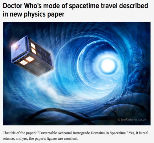
Co-authored by physicists Ben Tippett* and David Tsang (non-fictional physicists at the fictional Gallifrey Polytechnic Institute and Gallifrey Institute of Technology, respectively), the paper – which you can access free of charge over on arXiv – presents a spacetime geometry that would make retrograde time travel possible. Such a spacetime geometry, write the researchers, would emulate “what a layperson would describe as a time machine“ [x]
Eclipse Across America
August 21, 2017, the United States experienced a solar eclipse!

An eclipse occurs when the Moon temporarily blocks the light from the Sun. Within the narrow, 60- to 70-mile-wide band stretching from Oregon to South Carolina called the path of totality, the Moon completely blocked out the Sun’s face; elsewhere in North America, the Moon covered only a part of the star, leaving a crescent-shaped Sun visible in the sky.

During this exciting event, we were collecting your images and reactions online.
Here are a few images of this celestial event…take a look:

This composite image, made from 4 frames, shows the International Space Station, with a crew of six onboard, as it transits the Sun at roughly five miles per second during a partial solar eclipse from, Northern Cascades National Park in Washington. Onboard as part of Expedition 52 are: NASA astronauts Peggy Whitson, Jack Fischer, and Randy Bresnik; Russian cosmonauts Fyodor Yurchikhin and Sergey Ryazanskiy; and ESA (European Space Agency) astronaut Paolo Nespoli.
Credit: NASA/Bill Ingalls

The Bailey’s Beads effect is seen as the moon makes its final move over the sun during the total solar eclipse on Monday, August 21, 2017 above Madras, Oregon.
Credit: NASA/Aubrey Gemignani

This image from one of our Twitter followers shows the eclipse through tree leaves as crescent shaped shadows from Seattle, WA.
Credit: Logan Johnson

“The eclipse in the palm of my hand”. The eclipse is seen here through an indirect method, known as a pinhole projector, by one of our followers on social media from Arlington, TX.
Credit: Mark Schnyder

Through the lens on a pair of solar filter glasses, a social media follower captures the partial eclipse from Norridgewock, ME.
Credit: Mikayla Chase

While most of us watched the eclipse from Earth, six humans had the opportunity to view the event from 250 miles above on the International Space Station. European Space Agency (ESA) astronaut Paolo Nespoli captured this image of the Moon’s shadow crossing America.
Credit: Paolo Nespoli

This composite image shows the progression of a partial solar eclipse over Ross Lake, in Northern Cascades National Park, Washington. The beautiful series of the partially eclipsed sun shows the full spectrum of the event.
Credit: NASA/Bill Ingalls
In this video captured at 1,500 frames per second with a high-speed camera, the International Space Station, with a crew of six onboard, is seen in silhouette as it transits the sun at roughly five miles per second during a partial solar eclipse, Monday, Aug. 21, 2017 near Banner, Wyoming.
Credit: NASA/Joel Kowsky
To see more images from our NASA photographers, visit: https://www.flickr.com/photos/nasahqphoto/albums/72157685363271303
Make sure to follow us on Tumblr for your regular dose of space: http://nasa.tumblr.com


Geometry at work: Maxwell, Escher and Einstein
Maxwell’s diagram
from the 1821 “A Philosophical Magazine”, showing the rotative vortexes of electromagnetic forces, represented by hexagons and the inactive spaces between them
The impossible cube
invented in 1958, as an inspiration for his Belvedere litography.
Geometry of space-time
The three dimensions of space and the dimension of time give shape to the fourth, that of space-time.

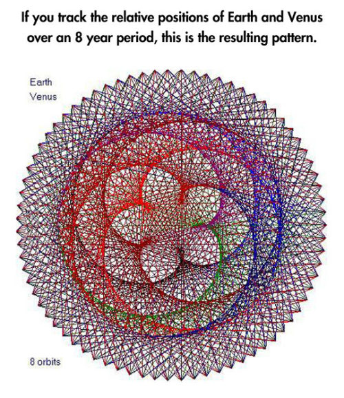

Planetary Frequencies.
-
 godisdeadandsoarehiscrimes liked this · 3 months ago
 -
 doodlebard reblogged this · 10 months ago
 -
doodlebard liked this · 10 months ago
-
 eth-ism-os liked this · 1 year ago
 -
 voidedwatcher liked this · 1 year ago
 -
 alovelyocean reblogged this · 1 year ago
 -
 jaxoline liked this · 1 year ago
 -
 patchwork-passions liked this · 1 year ago
 -
 lesquatrechevrons liked this · 1 year ago
 -
 pinkpineapples liked this · 1 year ago
 -
 lix88888 reblogged this · 1 year ago
 -
 mosseffect liked this · 1 year ago
 -
 withering-chariot liked this · 1 year ago
 -
 serkonans reblogged this · 1 year ago
 -
 nephbit reblogged this · 1 year ago
 -
nephbit liked this · 1 year ago
-
 panickingstudent liked this · 1 year ago
 -
 vongeek liked this · 1 year ago
 -
 arnim liked this · 1 year ago
 -
 beeslover69 liked this · 1 year ago
 -
 kiiblade liked this · 1 year ago
 -
 frisbeeperson liked this · 1 year ago
 -
 a-patchofmoss liked this · 2 years ago
 -
 seaglass-skies liked this · 2 years ago
 -
 buttercat-forever1 liked this · 2 years ago
 -
 sharas-bae reblogged this · 2 years ago
 -
 heelgripper reblogged this · 2 years ago
 -
 they-who-wander liked this · 2 years ago
 -
 h3k4te liked this · 2 years ago
 -
 morkazstuff liked this · 2 years ago
 -
 the-best-posts-from reblogged this · 2 years ago
 -
 ailingwriter liked this · 2 years ago
 -
 nomorepixels liked this · 2 years ago
 -
 vincentbounce liked this · 2 years ago
 -
 groovycroissont liked this · 2 years ago
 -
 highdefimission reblogged this · 2 years ago
 -
highdefimission liked this · 2 years ago
-
 youmustinteract reblogged this · 2 years ago
 -
youmustinteract liked this · 2 years ago
-
 theflyingheadb reblogged this · 3 years ago
 -
 rest-in-bees reblogged this · 3 years ago
 -
rest-in-bees liked this · 3 years ago
-
 newenglandofficial liked this · 3 years ago
 -
 dammitangel reblogged this · 3 years ago
 -
 corvidcorgi liked this · 3 years ago
 -
 booksandchainmail reblogged this · 3 years ago
